
Sunday, 20 December 2009
Tuesday, 15 December 2009


Monday, 14 December 2009
Things to do
- The Brief
- Key concept - Liiar
- Conventions of music magazine/textual analysis
- 3x front covers
- 3x contents page
- 3x double page spread
- Mind map; Planning- camera shots, name, audience, cover lines, typography (fonts, size, colour?)
- Organisation - Models, location, costume, probs, angle
- Mood board
- Mock up: front cover, contents page, double page spread
- Drafts; front cover, content page, double page spread
- Pictures, Diagrams..
- Final front cover
- Final contents page
- Final double page spread
- Evaluation - Denotation - What you can see and connotation - The meaning
Sunday, 6 December 2009
Conventions of double page spread
 image 1
 image 2
 image 3
Here are 3 images of different types of double page spread. That includes all the conventions of a double page spread, such as; heading, text (descriptions), images and page number.
Image 1 isn't a a double page spread from a music magazine. Majority of the images is on the top half of the page and the majority of the text is on the bottom half. The language used in this image is heading, images and text. The image contains 1 main heading, 1 sub heading, 5 images, article text. Normally there page numbers in the bottom corner of each corner. However i can't see any on this double page spread. The colours that is used in this double page spread is 3 different colours font is used for this contents page, these are; black, white and yellow/cream. The coloured background that is used is black and white. The institution for this double page spread is unknown however it is obvious that it's not from a music magazine. Probably from a environment magazine. The ideology for this magazine is the environment for the local area/society, an example of media that shows this is "in our urban environment". The audience for this magazine would be people who lives in the local area/people who are interested in the environment. The target audience are people who are the age from 25+ i would say. The representation for this magazine is local news, updates about the local area and environment.
Image 2 is a double page spread from a music magazine called "Kerrang" approximately 3/4 of the splash is images. The text is on the left side of the page and images on the right. With text on the images to show what they image connotes. The language in this is images and text. The page contains 7 images with one main one. That's is placed in the top centre of the page, with 3 image placed on top at the bottom of the image. There are page number at each bottom corner of the page, majority magazine have page numbers. There are 3 different types of colours that had been used for the front. These are black, white and red. The colour background that is used is black and white. Black for the white front so that it would show up as they contrast each other. The institution for this double page spread is Kerrang and the ideology for this magazine is rock, punk, goth, metal, thrash, classic indie and unsigned bands types music whereas considered important. An examples of media text that shows this is that main image place in the centre of the page, along with images around the main images, as the images consists 3 images of artist on guitar, 1 of fans and other with 2 artist and the shot was taken from a medium close up perspective. These images give off a rock type of genre. The target audience for this magazine is anyone who enjoy the types of genre that in the content of the magazine. The estimated average age of audience would be 23. The price of this magazine cost £2.99 this is affordable for teens as well as adults, as they can afford £2.99 weekly. The representaion for "Kerrang" is indie to rock and screamo. There would be a bit of every genre inside the magazine to attract different but similar audiences with similar taste in music.
Image 3 is a double page spread from a music magazine called "NME" 2/6 of the double page spread is the mashead 3/6 is the image (of Lily Allen) and 1/6 of the page is the text, however the text may run onto the next page or couple of pages in the magazine. The language in this page is images and text, the page contains 1 image, 1 main title and 3 area of text. There are page number at each bottom corner of the page, majority magazine have page numbers. There are 3 different types of colours of text in this image, these are black, white and red. The colour background that is used is black and white. Black for the white front so that it would show up as they contrast each other. The red font used as it balance from the image of Lily Allen's shirt, also the red font stands out and attracts the audiences' eyes. The institution for this double page spread is "NME" and the ideology for this magazine is punk rock however it is now indie, that is seen as important. An example of media language that connotes this is the masthead and image of the artist. Lily Allen is a artist that sings: pop, pop rock, ska, electropop, grime and alternative. The target audience for this magazine is anyone who enjoy the types of genre that in the content of the magazine. The estimated age range for this magazine is 16-28. The price of this magazine cost currently is £2.20 this is affordable for teens as well as adults, as they can afford £2.99 weekly.The representation for this magazine is from indie to rock and screamo. There would be a bit of every genre inside the magazine to attract different but similar audiences with similar taste in music.
Thursday, 3 December 2009
Conventions of contents pages
 image 2
 image 3
Here are 3 images of different styles of contents page.That includes all the conventions of a contents page, such as: numbered headings, small brief descriptions. Also images this is majority only in magazines and newspapers (in other words image[s] and text), however not all content pages has images for example in fiction books.
Image 1 isn't a music contents page. However image 2 and 3 is. Image 1 is arrange and lay (the splash) differently to image 1 and 3 as the numbered text on image 1 is all on the left hand side with one image on the right of a mid-age posh woman. The language used in this contents page is text and images. The colours that its used for this contents page is black, white, gold and red on a white background. The image has been edited so that it's black and white. The institution for this contents page is "Icons". The ideology is classic Hollywood, the piece of media language that show this is "CLASSIC HOLLYWOOD STARS & LIFESTYLES".The audience for this type of magazine are from the age of 45+. This magazine is mainly for American audience as this magazine is published in America in addition only American audience would know who the classic Hollywood star was. This reminisce the days they used to be in. This suggest to the audience how much Hollywood has changes in today's society. The representation for "Icons" is classic Hollywood.
Image 2 is a contents page from a magazine called "Kerrang" the layout is very different to image 1 and image 3. The language used in this contents page is text and images. There are 11 different images placed on this contents page, 3 different colours of font is used these are black, white and yellow. The coloured background used in this contents pages is white, black, yellow and red. The institution for this contents page is "Kerrang". The ideology for "Kerrang" magazine is metal the piece of media that shows this is "metallica". The audience for this magazine is from the age range of 16 to 28 . Who are into metal, rock, classic rock, and indie type of music. The representation for "Kerrang" is indie to rock and screamo. There would be a bit of every genre inside the magazine to attract different but similar audiences with similar taste in music.
Image 3 is a contents page from a magazine called "Epitaph". This content page is very different from image 1 and 2. One of the reason is because image 3 contents page is spread across two pages. The language used for this contents page is images and text. There are 6 different images used on this contents page. In addition 3 different colours used for the font these are black, white and blue. The colour background used in this contents page is white, red and blue. The institution for this contents page is "Epitaph". The ideology "Epitaph" magazine is rock music, the piece of media that shows this is "p58 vessels". Reason is because Vessels is a band that was formed in 2005 that produces Post-Rock, Alternative rock, Experimental rock music. The audience for this magazine is from the age range of 16 to 28. Who are into rock music. There are audience who are the ages below and over the age range, in addition majority the youth/teens nowadays would be interested this magazine, as society has changed and indie trend and music has become popular. The representation for "Epitaph" is rock music, this is because all the band name on the contents page is a form or rock band. From a range of Post-Rock, Alternative rock, Experimental rock, Classic rock.
Tuesday, 17 November 2009
Convention of front page
 image 1
 image 2
 image 3
Here are 3 images of music contents page of different genres. As you can see these music magazine have convention of a magazine and similar in ways layout(splash). All magazine has masthead, main image (which often covers the masthead slightly), anchorage, selling lines, cover lines, main cover line, mise-en-scene, bar code, issue number/dateline, model credit.
Image 1 contains all the conventions above that a music magazine have. The main image is overlapped the masthead because the main image is the selling point, that attracts the audience to buy. The language they have used is image a photograph of Taylor Swift also text/font as cover lines and masthead. They have kept the front cover page simple and clear by sticking to a few colours, these are white, blue and black. The institution is "Blender". "Blender" magazine's ideology is, pop music, whereas it is considered important.An example of Media Language that shows this is the cover lines "Panic at the disco, beg for a groupie ambush". The audience for this magazine is teenagers at the age group from 12-18. Majority of the audience would be female. The magazine cost approx £3($4.99). The magazine is for fans who would like to know the latest music and gossip in the music industry as well as the celebrities gossip and lives. The representation for "blender" is pop culture is because the main image is Taylor Swift and at the time her songs were very popular.
Image 2 contains all the conventions above that a magazine have. The main image is in the centre of the magazine. "Mojo" magazine are published monthly/ The languages of this magazine are images and text. There are more than one image used for this front over. The masthead of this magazine is "Rolling Stones", however this magazine is insert.They have kept the front cover clear by not having a lot of cover lines. Also have kept it simple by only using a few colour, these are black, white, orange and red. However there are other colours in the images in the bottom right corner. The institution for this magazine is "Mojo". The ideology for this magazine is classic rock 'n' roll, is it seen as important. An example of media language that shows this is "the worlds greatest rock 'n' roll band in action".The audience for this magazine would be music fans. This magazine cost £3.10 in 2000. Now in 2009 "Mojo" magazine cost approx £4.50. The age range for "Mojo" target audience from mid twenty's onwards, this is because this not everyone is willing to pay approx £4.50 on a magazine.
The representation for "MOJO" magazine is rock 'n' roll, reason is the main image on this splash is the "Rolling Stones" who are a rock 'n' roll band that came out in the 1960s.
Image 3 is layered (the splash) is different to image 1 and 2. One of the reason is that anchorage is displayed on top of the main image in the centre of the page. On image one the anchorage is on the side like a cover lines. That's doesn't really show the anchorage. However image 2 is different as it is an insert and not the actual magazine. The magazine NME is published weekly, every Tuesday.The language used for this front cover page is images and text. However the images and text is used and lay (splash) differently to the image 1 and 2 front cover page. For example where the text are place and images. On image 1 there is only one main image. However on image 2 and 3 there are more and not only one main image, the side images have a white boarder, this shows that the images are not related to the main image or the anchorage. The colours that have used for the text are yellow, white, red and black. The institution is NME and the ideology for this magazine is punk rock however it is now indie, that is seen as important. An example of media language that connotes this is "maniac street preachers". The audience for this magazine would be music fans that likes indie, and rock music who likes to be updated with the latest music and music industry as "NME" magazine is published every week. The target age group is from 18-28. However there are fans who are under the age of 18 who buys this magazine in addition majority the youth/teens nowadays buy this magazine, as society has changed and indie trend and music has become popular. The representation for this magazine is from indie to rock and screamo. There would be a bit of every genre inside the magazine to attract different but similar audiences with similar taste in music.
Monday, 2 November 2009
Key concept - LIIAR
L - Language E.G. Text, Images, Music, Photography, Comic etc.
I - Institution E.G. Companies, like Tv channel, magazine, radio station etc.
I - Ideology E.G. Idea of what the magazine would be selling. The idea of ideology for a fashion magazine will be fashion. Consumer's selling point eg. funky, natural etc.
A- Audience E.G. The target audience like age group for Cbbebies is 0-10
R- Representation E.G. Represents a certain something or some one. Like how we see a character in any way in Tv drama or film.
The Brief
Main Task: the front page, contents and double page spread of a new music magazine. All images and text used must be original, produced by your - minimum of four images
Presentation of your WORK: The presentation of the research, planning and evaluation may take form of any one, or combination of two or more, of the following;
Presentation of your WORK: The presentation of the research, planning and evaluation may take form of any one, or combination of two or more, of the following;
- a presentation using slideshow software such as PowerPoint
- blog
- a podcast;
Friday, 23 October 2009
College Magazine - Evaluation
Evaluation
In the past few weeks I have been researching, planning and creating to produce a college magazine front cover and contents page. I‘ve research different types of magazine and what the conventions of a magazine is, for example the differences between a fashion magazine and a college magazine.
I have created plans, drafts and mood boards with digital technology. However I have made some by hand which I need to scan and post onto my blog.
To create my front cover I used conventions of what all magazines should have mine include: Masthead, main image, selling lines, bar code, main story, model credit, date/issue, main cover line and cover lines. For my front cover the image was take from Canon Digital IXUS I zoom, 5.0 megapixels. I have taken some other photos that were taken from a camera that was the college. If I remember correctly I think it was a 10 megapixels. The photos taken from the 10 megapixels camera, I didn’t really like them, as I didn’t think they was professional enough when I looked at the photos they doesn’t feels as though it’s a magazine as I wouldn’t pick up a magazine looking like that in the first place, so I think neither will my audience.
The font that I have used for my front cover, in my opinion they’re suitable for the front cover. However I do think that I might have over done it. I found it difficult to find the right colour that would suit my front over. Because normally a magazine front cover the text/cover lines are bold and simple. However I have put ‘fill effects’ for some of mine, so that it stand out, but I really do think that I have over done it. I have used 4 different types of colours for my text. These are Red, Orange, Black and White because I think it suits the theme “Halloween”. Orange seems to be a theme for Halloween as pumpkins are orange, you may say that orange has become a symbol/tradition of Halloween. For the college title/masthead was planning to use blue or red. However blue didn’t really stand out or show up, so I used red. The main image and title/masthead was created in Adobe Photoshop CS3 as I wanted my model to be on top of the title/masthead. I haven’t edited or used any effect for my front cover; all I did was cut my model out and made it a layer on top of the title and background. When I researched magazine covers I realise that most magazine covers doesn’t over layer the masthead over their model. I have kept the image background as the original, as I believe it looks good as it is, than having a white background.
My audience is mainly Wyke college students however teachers and student’s family and relatives may pick it up and read or look at the magazine when the student takes the magazine home. So I have to make the magazine family friendly and suitable for all ages to look and read. If the magazine was real and to be published my magazine would contain: upcoming events, scores from games e.g. football or netball, important dates and also what’s going on inside and outside Wyke. For example if students have done something and they’re proud of and would like it to be published e.g. saved a life, won a football match, dance completion. Also contain messages that were on the PowerPoint in tutorial for students who missed it or want to know more information about it.
The strength for my magazine I would say it is the main image and masthead. The model for my magazine was one of my friends called Emily, she was happy to participate. The front cover is what sells the product to I would say the front cover is the most important, the language image is much stronger than text. The weakness would be the cover lines/colours of them and I don’t think they look as good as I wanted then to be. I have made drafts and steps by steps on my blog that you would see that I have gradually developed from stage 1.
Final - Front Cover
 As you can see the development from the pass post of the front cover that how it was made and how the design/layout was developed and made.

Thursday, 22 October 2009
Mood board

Here is a collection of magazine. That I made into a mood board. There is a mixture of front covers and contents page. I made this with Adobe Photoshop CS3.


images
 image 1
 image 2
 image 3
 image 4
 image 5
 image 6
Here are some photos that I taken that I can used for my magazine. I have taken more than this. But i don't think it is necessary to post them all on. The image that I am going to use is image 2, for my college magazine front cover. The magazine isn't going to be published. I am going to make a front cover, a mock up content page and a evaluation.
Wednesday, 21 October 2009
How to make a magazine front cover
I know that this may have nothing to do with college magazine cover. The other videos that I found off youtube doesn't really explain how to make a front cover but to edit a photograph and may the image looks good.
I think this is a really good example how to make an magazine. Once you've watched the video you would understand what I mean. The person who created it use Adobe Photoshop CS3.

The ingredients:
Use on front cover
Masthead (logo)
The name of the magazine displayed in a specific typeface. This is the visual branding of the title and is often done in a specially designed typeface to be very recognisable and unique. The masthead is usually used on the contents page inside as well as the front cover, and as a logo for advertising and branding purposes
Dateline
Month and year of publication, often with the price. Note that a monthly magazine usually hits the news-stands the month before the cover date
Month and year of publication, often with the price. Note that a monthly magazine usually hits the news-stands the month before the cover date
Main image
In the case of this front cover there is a single image of the model Shania. The image is used in a classic way, the face is big enough to stand out on the news-stand, with the model making full eye-contact
In the case of this front cover there is a single image of the model Shania. The image is used in a classic way, the face is big enough to stand out on the news-stand, with the model making full eye-contact
Model credit
This says: 'Shania: So hot.' It is unusual for such a credit to appear on a magazine front cover, but is done on fashion magazines. The photographer and model credit is usually on the contents page
This says: 'Shania: So hot.' It is unusual for such a credit to appear on a magazine front cover, but is done on fashion magazines. The photographer and model credit is usually on the contents page
Coverlines
Cosmopolitan magazine uses a lot of cover lines, which are distributed around the main image without detracting from it too much. A mistake often made with cover lines is that they run over an image that has a lot of colour changes, rendering the words invisible. This is a problem here with the red text on the hair on the left and the smaller yellow text against Shania's skin
Cosmopolitan magazine uses a lot of cover lines, which are distributed around the main image without detracting from it too much. A mistake often made with cover lines is that they run over an image that has a lot of colour changes, rendering the words invisible. This is a problem here with the red text on the hair on the left and the smaller yellow text against Shania's skin
Main cover line
This is very large - taking up almost a quarter of the magazine cover - and comes in three layers, each with a different colour. It promotes the use of naked male centrefolds, a feature of Cosmopolitan in the UK since its first issue. Note the main cover line is positioned against the model's shoulder so it shows up clearly
Left third
The left third of the magazine cover is vital for sales in shops where the magazine is not shown full-frontage. The title must be easily recognisable in a display of dozens of competitors. The start of the masthead is important here, as are short cover lines that are easy to read
Bar code
Standard bar code used by retailers
Standard bar code used by retailers
Selling line
Short, sharp description of the title's main marketing point (for Cosmopolitan: 'The world's No 1 magazine for young women') or perhaps setting out its editorial philosophy
Short, sharp description of the title's main marketing point (for Cosmopolitan: 'The world's No 1 magazine for young women') or perhaps setting out its editorial philosophy
Types of shots
 I found this image on the internet it demonstrates the different camera shots. I will be using Medium Close up (5).
Monday, 19 October 2009
College magazine info
To make my front cover I am going to use DTP and Adobe Photoshop CS3. Reason is because I would be doing some editing which DTP doesn't however Adobe Photoshop CS3 does. Like editing the image of the front cover.
Example of a contents page

Here's a picture of a content page from google. Like all contents, this one also have all the information that is needed for the audience. That includes all the conventions of a contents page, such as: numbered headings, small brief descriptions and similar layout to others.
The magazine that i am going to make for my college (Wyke) would include a lot of information about the college for example holiday dates, and events like the Halloween party coming up. And about what visitors would be visiting Wyke and when e.g last week NHS for the HPV jab. When they're next visit will be.
The contents page would have all the numbers of pages of whats on what, so that the the audience can find the page they want to read much quicker.
Seconary resourses / Example - Mother magazine - made up

Thursday, 15 October 2009

Monday, 12 October 2009
The Media Concept of LIIAR
L - Language E.G. Text, Images, Music, Photography, Comic etc.
I - Institution E.G. Companies, like Tv channel, magazine, radio station etc.
I - Ideology E.G. The idea of ideology for a fashion magazine will be fashion. Consumer's selling point eg. funky, natural etc.
A- Audience E.G. The target audience like age group for Cbbebies is 0-10
R- Representation E.G. Represents a certain something or some one. Like how we see a character in any way in Tv drama or film.
Thursday, 8 October 2009
Example of a college magazine

Here is an example of a college magazine. The name of the magazine is "COLLEGE". This obviously shows that its a college magazine. So it would be different from different other type of magazine like the example I use "ELLE". Which is a fashion magazine. Fashion types of magazine would normally be about celebrity fashion, and beauty. And music magazines would be about music, bands and when they're gigs are. College magazine would have information to let the students know whats going on inside and outside college. Would also have tips about what to do and what not to do. Like what would happen if girls got pregnant at a young age, that it would ruin her future. Including ways that can improve they're study/college life. And the gossip of the week. Would have dates and such for events like Halloween Party etc. The target audience would mainly be student however college staff and student's parents & family would may read them. So that the family of the student knows whats happening in the college their son/daughter attend to. The content of the magazine would have to be appropriate and affordable for everyone to read. Eg. No Porn, the type of language used, the price (£1 and not £5) etc...
Monday, 5 October 2009
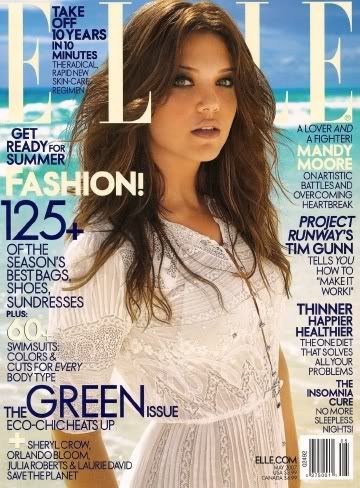
ELLE MAGAZINE


http://i7.photobucket.com/albums/y279/NrllAless/blog/news/covergirls/mandy-moore-elle-magazine-1.jpg
http://www.asiaenews.com/wp-content/uploads/2009/05/jun-ji-hyun-elle-magazine-cover.jpg
ELLE magazine is about fashion, beauty and star's style and news. About whats in and whats not. ELLE magazine is a global magazine that is published all around the world. In the United States, United Kingdom, Spain, France, China, Hong Kong, Japan and many many more. ELLE magazine is produced in different languages and every month in different countries the front cover is different.
Their target audience is women round aged 18-35 however they do get readers how are under and over the target age.
Monday, 28 September 2009
Conventions of a Contents Page
All contents page shows the audience/reader the information what the magazine is about. Connotes the brief of the magazine, like a 'key' on a 'map' and such. It doesn't need to be fancy, the important is that it has to be legible to the reader. So that they know what's the magazine going to be about and shows what story or info is on what page.
Conventions of a College Magazine.
The convention of a magazine is that they all have a front cover, title, bold texts, selling lines, cover lines, date of the magazine publishing.
The title/name of the magazine becomes the language and representation to the audience. The front cover image changes all time, as well as cover lines (text) that shows what the magazine is about for this issue, and the date.
However there always have a front cover, title, cover lines and date of issue.
The Brief
Preliminary exercise: using DTP and an image manipulation program, produce the front page of a new school/college magazine, featuring a photograph of a student in medium close-up some appropriately laid-out text and masthead. Additionally you must produce a mock-up of the layout of the contents page to demonstrate their grasp of DTP.
Main task: the front page, contents and the double page spread of a new music magazine. All the images and text must be original, produced by you - minimum of four images.
Presentation of your work
The presentation on the research, planning and evaluation may take the form of anyone, or the combination of two or more, of the following:
- a presentation using a slide show software such as PowerPoint;
- a blog
- a podcast;
Subscribe to:
Comments (Atom)