
Front cover

Contents page

Double page spread
The Brief of this main task for this portfolio is to produce a front page, contents and double page spread of a new music magazine. The presentation of the research, planning and evaluation takes form of a blog. http://sofili71092.blogspot.com
To make my magazine I had to research the convention of a music magazine for front page, contents and double page spread. To do this I have done textual analysis for the 3 different types of pages, from magazines. These were front cover page, contents page and a double page spread. To analysis these pages I used the key concept of LIIAR (Language, Ideology, Institution, Audience and Representative) to find out and express what other magazines target and what their ideology, they represent and their target audience. To find the conventions and codes I had to find front pages, contents pages, double page spreads in different genre and different magazine company to find out their LIIAR of their magazine and find out that all magazines have similar convention.
My media product (magazine) had developed and challenge forms and convention of the real media products. However I think that touch up can be done to make it more realist, as I didn’t have the budget for props and costume and the skills to produce a perfect magazine like real media product magazines that get sold in the public market and get the view of the public eye. I have problems with working with Photoshop. To overcome this weakness of mine I would need to use Photoshop more often and explore the use of Photoshop to gain skills. I do think that my magazine challenge forms of some real media products, the style and design however I think that the magazine can be improved if I had the skills and more knowledge about music magazines.
Conventions of all magazine are the front page must have a masthead, dateline, main image, cover lines, main cover lines (anchorage), barcode and price My new music magazine front cover contains all the conventions on a real media product magazine’s front page. The main image is overlapped the masthead because the main image is the selling point, that attracts the audience to buy. The language that I have used is images/photographs, text, font, masthead, main cover lines, covers lines and barcode. I have kept the front cover page simple and clear by sticking to a few colours, these are black, white and red.
Conventions of all contents page must contain heading, numbered headings, small brief descriptions text and images. My new music magazine contents page contains all the conventions on a real media product magazine’s contents page. There are 6 images on my contents page with masthead on the page. The language used in my contents page is images/photographs, text, font, numbers, masthead. There are 4 different colours used in my contents page, these are red, orange/peach, black and white.
Convention of all double page spread is that all must contain a heading, text (descriptions) main image and page numbers. My new music magazine contains the conventions of a magazine’s double page spread. The language used in my double page spread is image/photograph, text, font, numbers, masthead. There are 3 different types of colours used in my double page spread, these are red, black and white.
My media product represent particularly social group of people of youths who are into indie, indie rock, and rock music, who would enjoys all types of music especially independent bands that are nationally known or locally.
The institution of my new music magazine is “Musite” and the ideology of the magazine is indie music. An example of media language that shows this is “live gig” gigs are what indie bands do.
During my planning process, I made a basic plan for my magazine such what name the magazine would be called, typography, cover lines to use on the front page, my target audience and the price of the magazine. I had to consider the language, ideology, my target audience and representative of my new music magazine. My organisation for the magazine was to take into account the location/setting of where the photos can be taken, the types of camera shot & angels, the costume and props that would be needed for my models and how many models I needed and what are my models going to be, such as a solo artist or a band. I made a mood board using Adobe Photoshop CS3 and got images of front covers, contents page and double page spread from the internet of different types of magazine such as fashion and music magazine to gather information of the convention of magazine and what magazine look like.
A media institution is an established, often profit-based organization, which deals in the creation and distribution of advertising, entertainment and information services. Media institution such as a publishing company might distribute my music magazine, because my magazine may be appealing to the public which the public would like to consume my music magazine, so the publishing company wants to distribute my music magazine to that they can earn profit by publishing my music magazine and making profit off the public who buys my music magazine.
To produce the text in my new music magazine I used the computer’s software and choose the font that was already installed on the computer at college and choosing the font that fits the genre of my music magazine. I also used a website www.dafont.com to produce my text in my music magazine as the installed software on the computer was limited and not have a wide range and vary of different types of font. However to alter my font from the website I have to used Adobe Photoshop CS3 to change colours of the font and edit the font so that there wouldn’t be a background on the text when I placed the text on my 3 pages.
During drafting stage I tried a few styles, layout, fonts, colours and images that suit my genre and choose which looked the most effective.
For my front cover I firstly started if not many images and started to Photoshop them so that it looks more professional than looking like amateur photography. The images I taken at first was not up to my standards but I have to begin with something so I used the amateur photograph at first, they was amateur because at first I did not know how to take good photograph and did know what the model and I did not have my models in costume or have any props at all and took the pictures at a random location and not have a specific location. I also tried a few masthead and cover lines however the first masthead was too long for a magazine, the second masthead was suitable. At first the cover lines had nothing in relation of music and did not make any connection. Afterwards I changed the cover lines that realise to music so that it would show the audience that it’s a music magazine. The text on my front cover was from www.dafont.com . To make my new music magazine front page I used software called Adobe Photoshop CS3.
I started my contents page afterwards, I still haven’t got the appropriate photographs at this stage, I have started to research different types of contents pages and designed a mock up of how I wanted my contents page to be layout. I then made a decision and started making my contents. I didn’t have enough images so I got one of my friends to be a model for me. However the photographs I have taken was moderate quality and not up to my standards of how I wanted my photos to look like.
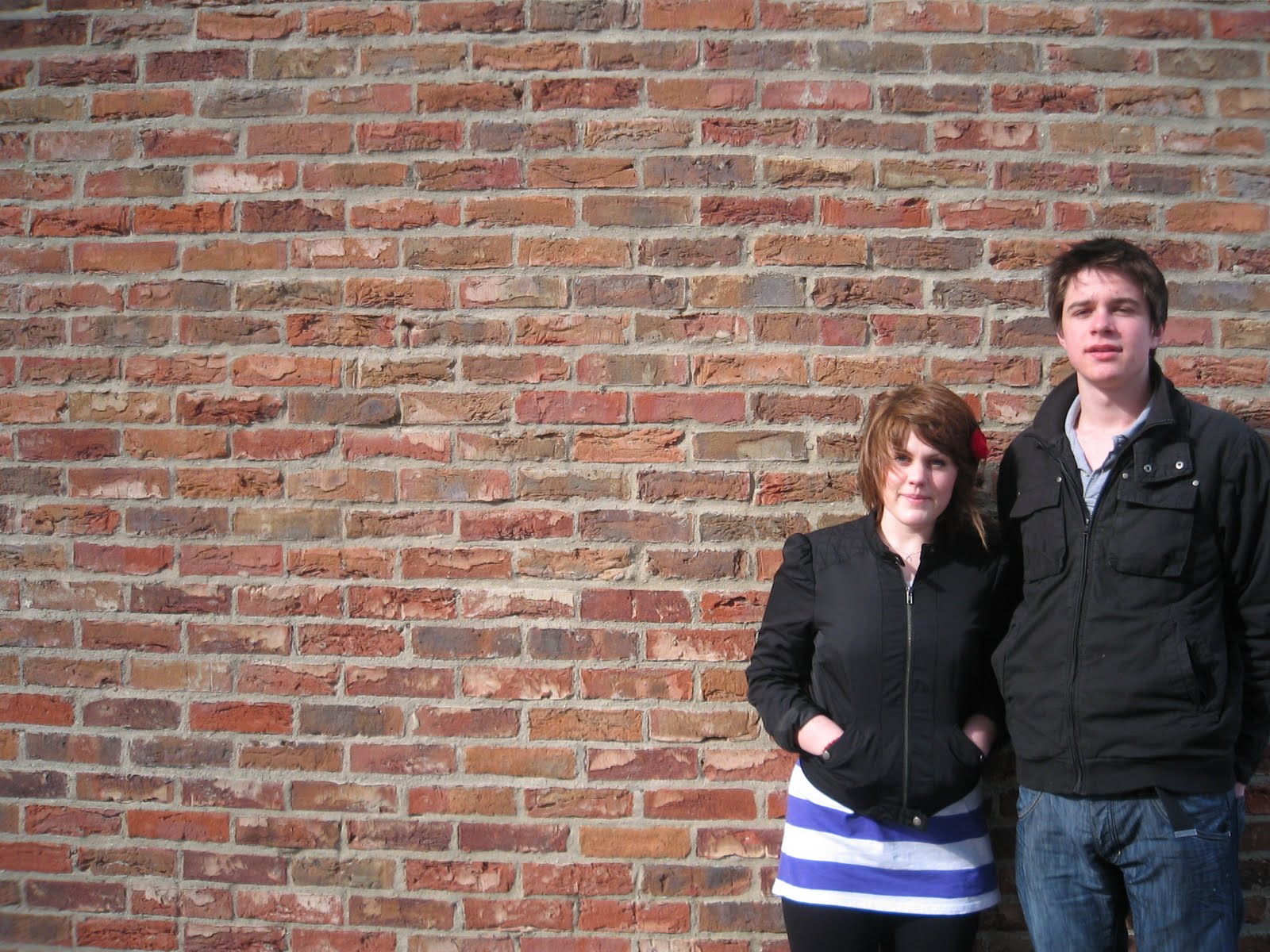
I wanted to use one of my sub-images on my contents page to be a main image on the page firstly, for the reason not using it is because the image isn’t appropriate as no artist would allow a magazine to publish a photograph as such to the public. The magazine is a music magazine and not a gossip magazine. I was running out of time, as soon as I can I asked my friends to dress up with casual but dress up slightly the next day to fit the mise-en-scene that I was aiming for. We also used the music technology department at my college if I could use the room and instruments for my media, and friendly enough the teacher permitted it for the scenario mise-en-scene. Also took pictures with a brick laid, wood and white hexagon background. I got the opportunity from two friends who were available to be my model for my contents page main image as well as for my double page spread. They was the type of imagery and mise-en-scene I wanted, I should have asked them in the first place instead of being too shy to ask for help. To create the round edges of the images I used the eraser as that is the only way I know how to create the round effect, this is why it may look tacky. The text used in my contents page was from www.dafont.com and the software I used to make my new music magazine contents page I used Adobe Photoshop CS3.
I started on my double pages spread, then realising that the front cover page’s masthead needs changing as well as the font used for the cover lines. The image for the double page spread was not altered, only maximised to fit the page and at the position of where I want the image to be. I got the main heading from www.dafont.com the font was originally black I used Adobe Photoshop CS3 to change the font to white as I believe the font looks more appropriate in white than black. I put in number pages and the masthead at each bottom corner of each side. The masthead and page number was from www.dafont.com and was changed by Adobe Photoshop CS3. The sub-heading and the article (interview) was inserted and created from Microsoft Office Publisher also known as Desktop Publisher (DTP). The font was already installed onto the computer software. I found it difficult to find the appropriate colour for the article (interview). I still believe that the colour for the sub-heading and article (interview) is unsuitable; however I can’t find a more appropriate colour to use.
When finished the contents page and double page spread, I realised that the image used for the front page was inappropriate and does not connotates as there wasn’t any other images of the same people on the front cover on the contents page or double page spread. Therefore I decided to change the main image on the front page to an image of the my two models who’s on the main image on the contents page and double page spread, that allowing the audience know that the main story of the magazine is “The Ding Dings” and not “Sum Dagger”. I had to change the main cover lines to fit the new main image and I have to move the dateline and price from the right hand side of the magazine under the masthead to the left hand side as it isn’t visible on the right.
The language used in my new music magazine is text and image, the colour used in the magazine altogether is red, black, white, orange, peach, for font and background. The institution for this magazine is “Musite”, the ideology is independent music (aka Indie music) the piece of media language that shows this is “independent band” located on the contents page under the sub heading “06. Metric”. The audience for this magazine are music lovers who enjoy indie, rock music. Also targets both females and males, young adults from the age range of 17-30. However the magazine may take interest of audience whom are not in the age range. The price of the magazine is £2.50 which may means that not anyone would be willing to buy a magazine for £2.50 as they may not be able to afford it.
I have made a poll on my blog (www.sofili71092.blogspot.com) to gain audience feedback. I have asked 4 questions. Here are the results so far.
“What do you think could be changed to improve my magazine?”
• Image
• Text/font .................................................2(28%)
• Layout/design ...........................................1(14%)
• None .......................................................4(57%)
“What genre of music do you think my magazine is?”
• Pop
• Indie .......................................................6(100%)
• Rock
• Punk
“On a scale of 1 to 4 how appealing is my music magazine?
(1-Appealing 4- not appealing)
• 1 ............................................................5(71%)
• 2
• 3 ............................................................2(28%)
• 4
“Does each page appear to have too much or too less information shown?”
• Too much
• Too little
• Just about right .......................................2(33%)
• Just right ................................................4(66%)
My audience feedback tells me that my magazine can be improved if I changed the text/font and layout/design. My magazine’s ideology and representativeness have reached to the audience the evidence to show this is 100% of my audience believes that my magazine is an indie genre magazine. The third question asked connotes that my magazine is appealing some but does not apply to all audience, this can be due to the genre of the magazine that not all audience like indie music, and they prefer pop and R’n’B music for instance. Or it can be the design of the magazine the do not like or they may not be in the target audience category e.g. not at the age of the target age range. The feedback allows me to know that I have the right amount of information shown on the magazine that doesn’t overloads the audience as it isn’t too much or too less to read.
In my opinion, from my audience feed back shows me that my audience like my magazine and feel that it does look like a real media product like the ones on the market and they think that there not no problem with the images that I have used and that they fit into the genre/theme. However there are errors in other areas for instance the text/font used and layout/design. Therefore I can improve my new music magazine, thanks to my audience feedback. Without making a audience feedback I will not know that where are the errors and where I can improve.
From the process of constructing a new music magazine I have learnt about the technologies such as the use and skills of Adobe Photoshop CS3 and Microsoft Office Publisher (also known as Desktop Publisher [DTP]) to be able to make drop caps and layout. I learnt that Photoshop is hard to get the hang of at first but it gets easier the more you use it. Practice makes perfect. To take a good photograph isn’t as easy as just pressing a button, there are skills needed to take a good photograph to focus. Never delete unused photographs and out of focus photographs as they can be in use in future and to keep them allows you to know what errors not to make the next time.
Looking back at the preliminary task, I feel that I have learnt a lot in the progression from it to product the full product. As I have gains a lot more skills for using Photoshop and that DTP isn’t useless, and have a use for designs. As I in the past I used to think that DTP was a rubbish version of Microsoft word. The preliminary task I only used Photoshop slightly as the only think I did was cut round the image to that the model was on top of the masthead which was both created in Adobe Photoshop CS3, the cover lines was created in DTP, meaning that I didn’t use Photoshop as much as I could of. However for my main task, I created 9/10 of my work on Adobe Photoshop CS3, the 1/10 was created in DTP this is the description (interview) on the double page spread.
In my opinion I feel that I have made a large progress from doing the preliminary task to making the main task (new music magazine). I believe my skills can be improved with more practice on Photoshop to gain the skills. I have the potential to do well, I need to not learn and push myself not to leave everything till the last minute.
Blog URL: www.sofili71092.blogspot.com
Software used: Adobe Photoshop CS3, Microsoft Publisher, Microsoft Word
Websites used: www.dafont.com, www.google.co.uk
Technology used: Nokia 5800 camera 3.2 megapixels, Canon Digital IXUS i zoom 5.0 megapixels.
 Front cover
 Contents page
 Double page spread


